

How to Plan Your Squarespace Homepage for Conversions and Build Trust From the First Click
Your homepage is the first conversation your brand has with your dream client. But too often, business owners treat it like a bulletin board instead of a welcome mat.
Your homepage isn’t where you list everything you do — it’s where you build trust, spark curiosity, and guide visitors toward one clear next step. Whether your goal is to book clients, grow your email list, or position yourself as a leader in your industry, a strategic homepage can do all three when it’s built with intention.
Today, I’m walking you through my process for planning a homepage that converts — from strategy and structure to real client examples that show how design and connection work together.
What Makes a Homepage Convert
The women I work with are already successful. They’ve built something beautiful — a business that’s making an impact, changing lives, and supporting their version of freedom. But now they’re ready for more.
They’re craving refinement, alignment, and a digital presence that feels as elevated as the work they’ve poured their hearts into. They don’t just want another website. They want a brand home that reflects the woman they’ve become and the vision they’re stepping into next.
A high-converting homepage doesn’t just share what you do. It creates a feeling — one that instantly communicates who you are, the quality of your work, and the level of experience your clients can expect when they choose you.
It’s where trust begins.
1. The Headline and Hero Section: Creating a Feeling That Connects
Your hero section is the first moment someone experiences your brand. Before they read a single word, they’re already forming an impression about your professionalism, energy, and confidence.
This is where design and emotion meet.
Your headline is the anchor that holds everything together — it should be clear, grounded, and intentional. Think of it as your brand’s elevator pitch, written for the person who’s already halfway to saying yes.
For example, my own homepage headline reads:
Strategic, high-converting websites for women in business.

It’s simple and direct, but it speaks to something deeper. It tells my audience that I see them as the visionary women they are — women who lead with purpose and want every touchpoint of their brand to feel aligned, beautiful, and powerful.
Equally important is the image you pair with your headline. It sets the tone before words ever do.
A service provider or coach might use a bright, welcoming workspace photo with natural light and soft textures — something that says, “You can exhale here.”
A creative entrepreneur could choose a behind-the-scenes moment, like sketching ideas, arranging props, or working at her laptop — it tells a story of flow and artistry.
A professional or thought leader might use a clean, minimal portrait — standing confidently, perhaps near a window, surrounded by elements that feel elevated and intentional.
The right imagery makes your audience feel understood. They should look at your homepage and think, This feels like me.
When your headline and hero image work together, they do more than catch attention. They create belonging.
2. The About Section: Start the Conversation
Once someone feels connected through your hero section, the next thing they want to know is who’s behind the brand. But your About section isn’t about sharing your full story — it’s about helping your visitor feel seen, understood, and invited in.
This is where you begin to build emotional connection. You’re giving people a glimpse of who you are and how you show up for your clients, not just what you’ve accomplished.
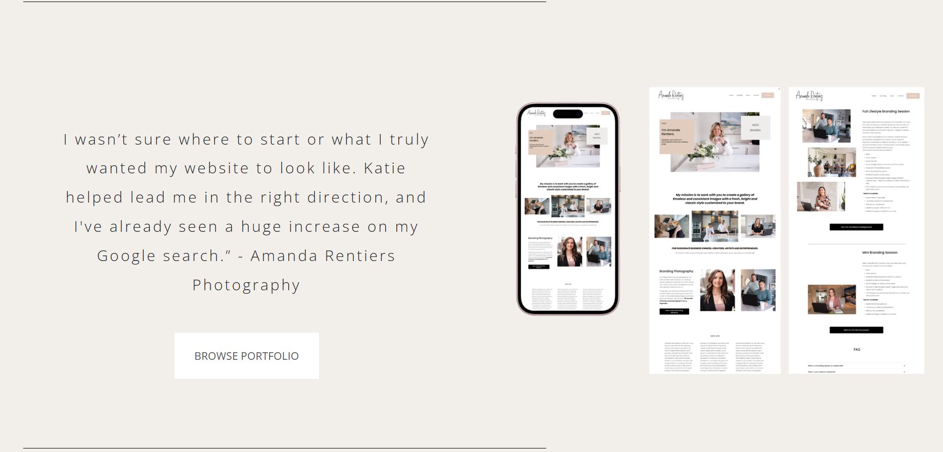
For Angelica’s website, we wanted to create a warm and welcoming space for her clients to explore. Everything from the images we chose to the tone of her copy and even the wording on her call to action button was done with a single message in mind: you’re welcome here.

Her About section gently introduces visitors to who she is, her approach to therapy, and what it feels like to work with her. It’s conversational and compassionate, written in a way that mirrors how she speaks to clients in their sessions together. The goal was to make someone pause and think, this feels like a place where I could exhale.
If you’re writing your own About preview, focus on how you want people to feel rather than what you want them to know. Share a sentence or two that reflects your values, your approach, or the transformation you help create. It doesn’t have to be long — it just needs to be honest.
When your About section feels human and heartfelt, it turns visitors into connections.
3. The Services Section: Guiding Visitors With Clarity and Ease
When it comes to your Services section, clarity is everything. It’s where your visitors start to see themselves working with you and where curiosity begins to turn into action.
For Cheri’s website, we approached this section with the same intentionality as every other part of the design. Her goal was to help her clients feel informed and confident as they explored their path to homeownership, without confusing them with industry terms or lengthy explanations.
We created a Services section that introduced her main offerings in a clear, visually calm way. The wording focused less on mortgage products and more on what those services meant for her clients — clarity, confidence, and support every step of the way. Each section included a short description and a simple next step: an invitation to explore what path to homeownership made the most sense for them.
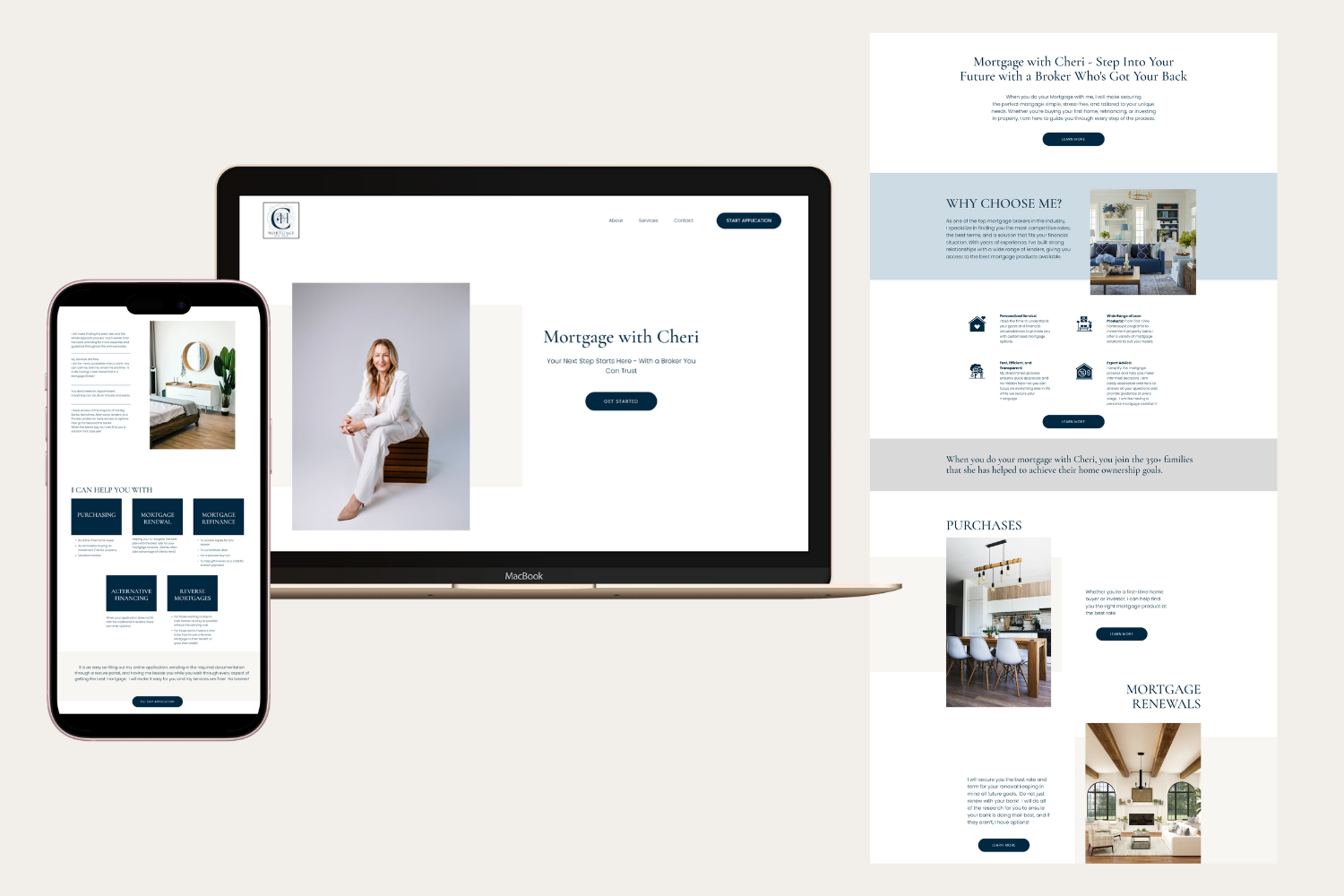
It’s subtle, but powerful. That small shift — from “here’s what I offer” to “here’s how I can help you” — builds trust and momentum.
If you’re building your own Services section, think about the journey you want your visitors to take. Start by introducing the transformation you provide, then briefly outline your offers, and finally, include one clear call to action that guides them forward.
Your Services section just needs to help them take the next step with confidence.
4. Testimonials and Social Proof: Build Trust Through Story
Testimonials are one of the most powerful ways to show credibility on your homepage. But not all testimonials hold the same weight, and including too many can overwhelm your visitor. We want to strategically choose the ones that highlight the transformation you provide for your clients.
The best testimonials go beyond compliments. They tell a story. They reflect the emotions, results, or clarity your clients felt after working with you. They act as proof that your process works and that the experience you create is intentional.
Here’s an example of the difference between a good and a great testimonial:
Good:
“Katie was wonderful to work with. She built me a beautiful website and made the process easy.”
Great:
“Working with Katie helped me finally feel confident sharing my business online. She understood my vision, elevated my brand, and built a website that’s brought in new, aligned clients every month.”
The second one does more than praise the result — it reveals the transformation and emotional impact. That’s what makes it memorable.
When choosing which testimonials to feature, look for ones that mention how your clients felt before, during, and after working with you. What shifted for them? What did your process make possible?
I like to include them close to the services and end where it naturally fits in. They may read your services and then keep scrolling, read an inspiring testimonial, and then have the opportunity to connect with you, view your portfolio, or explore your services more deeply.
Every testimonial is a reflection of the experience you’ve created. When you choose them with intention, they become one of your strongest tools for connection and conversion.
5. The Call to Action: Lead With Intention
Your call to action is the bridge between curiosity and connection. It’s the moment when someone feels ready to take the next step and your job is to make that step easy, inviting, and clear.
Every homepage should have one primary goal. Maybe that’s booking a discovery call, downloading your free resource, or exploring your portfolio. Once you’ve defined that goal, repeat it throughout your page in subtle, intentional ways.
On my own homepage, for example, I use three main calls to action:
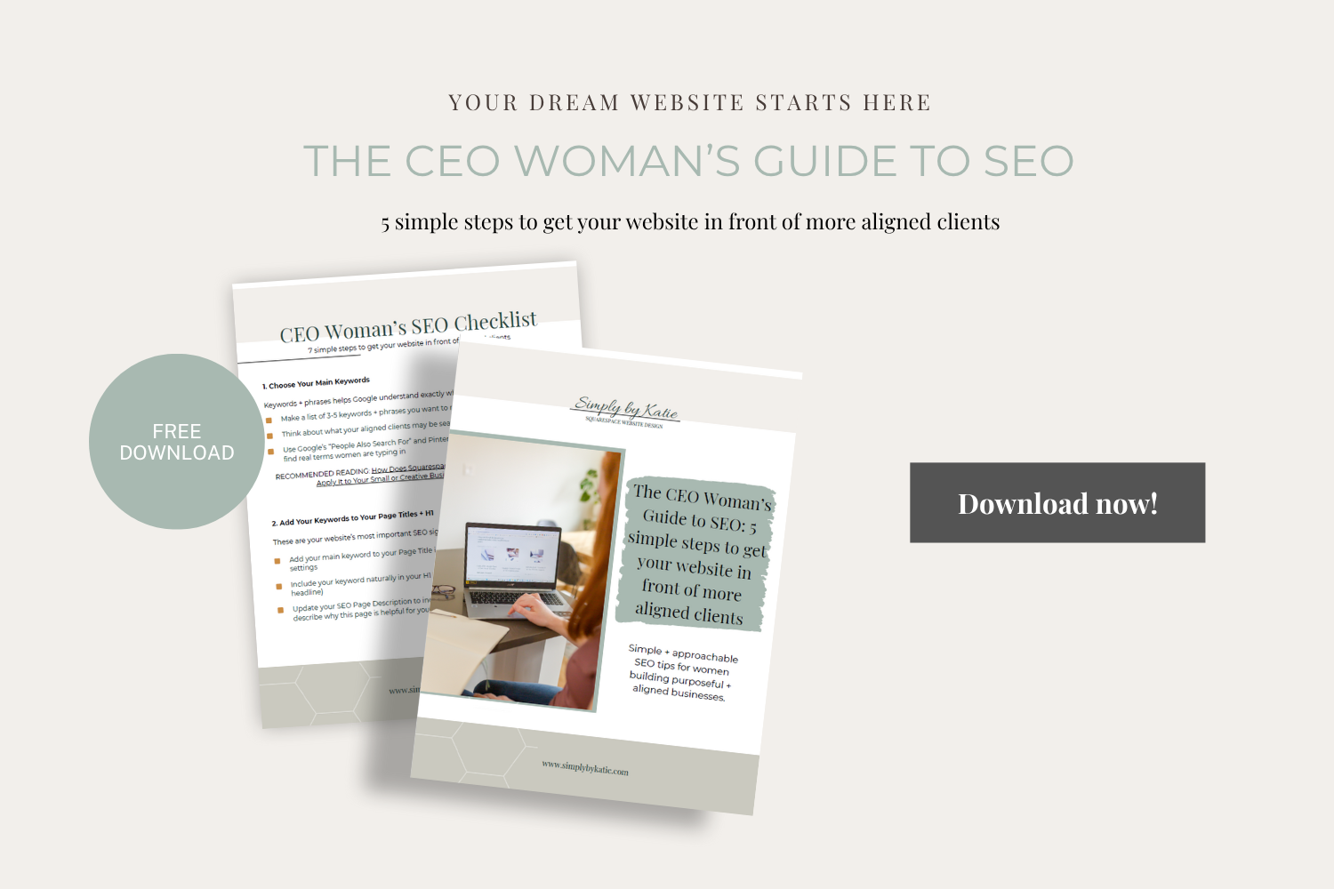
Download The CEO Woman’s Website Blueprint: a way for visitors to receive instant value and build trust.
Explore My Portfolio: for those who want to browse and see what’s possible before reaching out.
Book a Free Connection Call: an easy next step for women ready to elevate their brand and move forward.
Each CTA serves a purpose and meets my audience where they are. Someone might not be ready to book a call yet, but they’ll happily grab a free resource or look at past projects to build confidence in their decision.
Your call to action should never feel forced. It’s an open door, a gentle invitation to take the next step toward working with you.
My Process for Designing a Homepage That Converts
Every homepage I design begins with clarity. Strategy always comes before design because the most beautiful websites are the ones built with intention behind every detail.
Here’s what that looks like:
1. Define Your Goals
Before any design begins, I help my clients define their website goals. Do they want to book more clients, hit a specific revenue milestone, or position themselves as an expert in their field? Understanding this shapes every design and messaging decision that follows.
2. Understand Your Audience
Next, we look closely at their ideal client. What are they searching for? What are their goals, struggles, or desires? How do they speak and make decisions? This research ensures the homepage communicates in a way that resonates so every word and image speaks directly to the right person.
3. Map Out the Flow by Hand
This is where I slow down and connect with the story we’re telling. I map each homepage by hand before touching Squarespace, sketching the user journey and noting how I want visitors to move through the page. This process keeps me focused on clarity, hierarchy, and feeling, not just design.
4. Create the Prototype
Once the structure feels aligned, I bring it to life in Squarespace. This is where strategy and creativity meet. Every element — from spacing to typography — has a purpose. I refine until the flow feels intuitive and the message feels clear.
5. Refine for SEO and Conversion
Before launch, I make sure everything is optimized. Titles, headings, image names, and alt text are updated for SEO. Every section has a clear next step. It’s where we turn thoughtful design into measurable results.
6. Create Systems for Growth
A strategic homepage is only the beginning. In The CEO Woman’s Website Blueprint, I share how to build a complete website system that continues to grow with you, helping you stay visible, aligned, and connected without burnout or confusion.
FAQ: Planning Your Squarespace Homepage for Conversions
1. How do I make my Squarespace homepage show up on Google?
Start by optimizing the basics: your page title, meta description, and headings. Use keywords your ideal clients are actually searching for. For example, a psychologist might include phrases like anxiety therapy in Calgary or counseling for new moms to reflect what their audience is typing into Google. Rename your image files before uploading and include descriptive alt text that reflects what’s in the photo.
For a step-by-step guide, read my post What SEO Really Means for Creative Women Entrepreneurs. It breaks down Squarespace SEO in plain language and shows you exactly how to optimize your site without the overwhelm.
SEO is an ongoing process. Keep your homepage content fresh, update your visuals as your brand evolves, and start writing informative blogs that are full of SEO keywords and genuinely valuable to your audience.
2. How long should my homepage be?
There isn’t one perfect length, but there is an ideal flow. Most converting homepages include 4–6 intentional sections: a clear headline, a short about preview, your main services, a testimonial, and a call to action.
Instead of focusing on word count, focus on experience. Does your homepage flow naturally? Does each section have a purpose? If you can tell your story, build trust, and invite action within a few scrolls, you’re in a great place.
3. Do I need SEO on my homepage?
Yes, absolutely. Your homepage is often the first page Google and your visitors see. It sets the tone for your site’s visibility and user experience.
Optimize your page title, add a meta description with your primary keyword, and make sure each heading includes relevant search terms. Use blog links, internal navigation, and consistent alt text to help search engines understand what your site is about.
Think of your homepage as the anchor of your SEO — every other page should connect back to it in some way.
4. What’s the best call to action for my homepage?
Your call to action depends on your goals. If you’re focusing on building your email list, offer something of value — a thoughtful freebie for instant download or a newsletter sign-up block that invites connection.
A study by Kit found that freebie opt-ins convert up to 4–6 times higher than generic newsletter sign-ups because they offer immediate value and give people a clear reason to join. The best approach is to test both and see what resonates with your audience.
If your goal is to book more client calls, make sure your primary CTA directs visitors toward booking a free consultation. You can include:
A main navigation button that says “Book a Free Call.”
Trust-building touchpoints throughout your homepage that link to your Portfolio or Services page.
A clear, friendly invitation in your footer that encourages visitors to connect when they’re ready.
The purpose of your CTA is to invite your visitors to take the natural next step.
5. What tools can help me track my homepage performance?
Squarespace Analytics is a great starting point. It shows which pages get the most views, how visitors are finding you, and which buttons they’re clicking. You can also use Google Analytics for more detailed traffic data or Hotjar for visual heatmaps that show how people interact with your page.
Tracking isn’t about numbers for the sake of numbers. It’s about understanding what’s working so you can make informed decisions. If visitors are scrolling through your services, clicking your CTAs, and spending time on your site, that’s a strong sign your homepage strategy is connecting.
6. How do I know if my homepage is actually converting?
A converting homepage guides visitors toward meaningful action — joining your list, booking a call, or exploring your services.
You can check this quickly in Squarespace Analytics. Look at your “Top Pages” report. If visitors are moving from your homepage to your Services, Portfolio, or Contact page, that means your flow and messaging are working.
If conversions are low, review your copy and layout. Often, one small shift like simplifying your headline or moving your CTA higher up the page can make a big difference.
7. How do I know what to say on my homepage?
Start with your audience’s goals. What are they searching for? What challenges are they facing? Then, focus your copy around the transformation your business provides — how you help them move from where they are to where they want to be.
For example, if you’re a mortgage broker, your ideal client might be searching for first-time homebuyer advice or how to get pre-approved for a mortgage. Instead of leading with services, you could start with a headline like:
Helping you feel confident and supported through every step of your home buying journey.
This kind of message builds trust, reflects empathy, and positions you as the expert who understands their needs.
The most effective homepages sound like a conversation, not a sales pitch.
Conclusion: Build a Homepage That Connects and Converts
A homepage isn’t just the start of your website. It’s the heart of your brand. When it’s built with strategy, clarity, and connection, it becomes the place where curiosity turns into confidence and visitors turn into clients.
When your message, visuals, and structure work together, your site starts doing the heavy lifting for you. You stop chasing attention and start creating trust.
If you’re ready to plan your homepage with strategy and ease, download The CEO Woman’s Website Blueprint. Inside, I’ll walk you through the same process I use with my clients to design Squarespace websites that convert with clarity, confidence, and heart.
And when you’re ready for deeper support, I’d love to help you design a website that feels like home for your brand — one that reflects your story, your energy, and your rhythm.
YOU MIGHT ALSO LIKE
Before and After: How a few Small Changes Can Turn Your Website Into a Dream-Client Attraction Tool
Life-First Web Design: Why Every Woman Entrepreneur Needs a Website That Works 24/7
Dreaming of a website that gets you more leads? Do this first!
10 Empowering Instagram Accounts Every Woman in Business Should Follow in 2025