

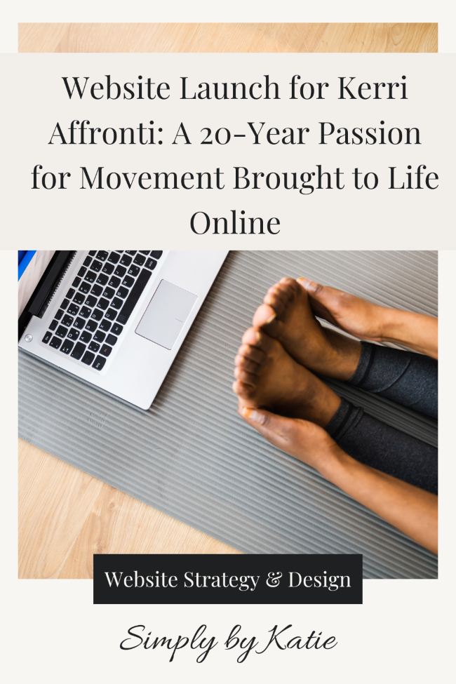
Website Launch for Kerri Affronti: A 20-Year Passion for Movement Brought to Life Online
When I first met Kerri Affronti, I could immediately sense the depth of her experience and the heart behind her work. Kerri has spent more than 20 years helping people feel strong, capable, and at home in their bodies.
Through her GYROTONIC® and GYROKINESIS® classes, she teaches clients how to move with intention, release tension, and rebuild strength from the inside out. Many of her clients come to her with tight hips, sore shoulders, and back pain from years of sitting or overuse.
What they leave with is something far deeper, a renewed connection to their bodies and the confidence that comes from feeling good again.
Her approach is gentle but powerful.
It’s about teaching your body to work with you, not against you.
After just one conversation, I could see how much she cared about helping others feel that same sense of ease and strength.
When Kerri reached out to me, she was just days away from launching her new website. She had already poured so much into it and needed support with the final stretch, the small but important details that would bring everything together before launch day.
We were working from a templated site, refining it so that her online space reflected the same care and professionalism she brings to her clients.
My goal was to help her cross the finish line feeling confident and supported so she could share her work and the strength she helps others build with a wider audience.
The Task: Refining a Nearly Launched Squarespace Website for Alignment and Confidence
Kerri’s website was so close to being ready, you could feel the energy and intention behind everything she had built. But like many women preparing to share their work with the world, she was balancing a long list of to-dos and final details.
She had the vision. She had the foundation.
Now, she just needed someone to help her pull it all together so it not only looked beautiful but felt aligned and complete.
This stage of a project is one of my favourites because it’s where everything starts to click.
We weren’t starting from scratch. We were taking something meaningful that she had already created and refining it so her audience could fully experience it.
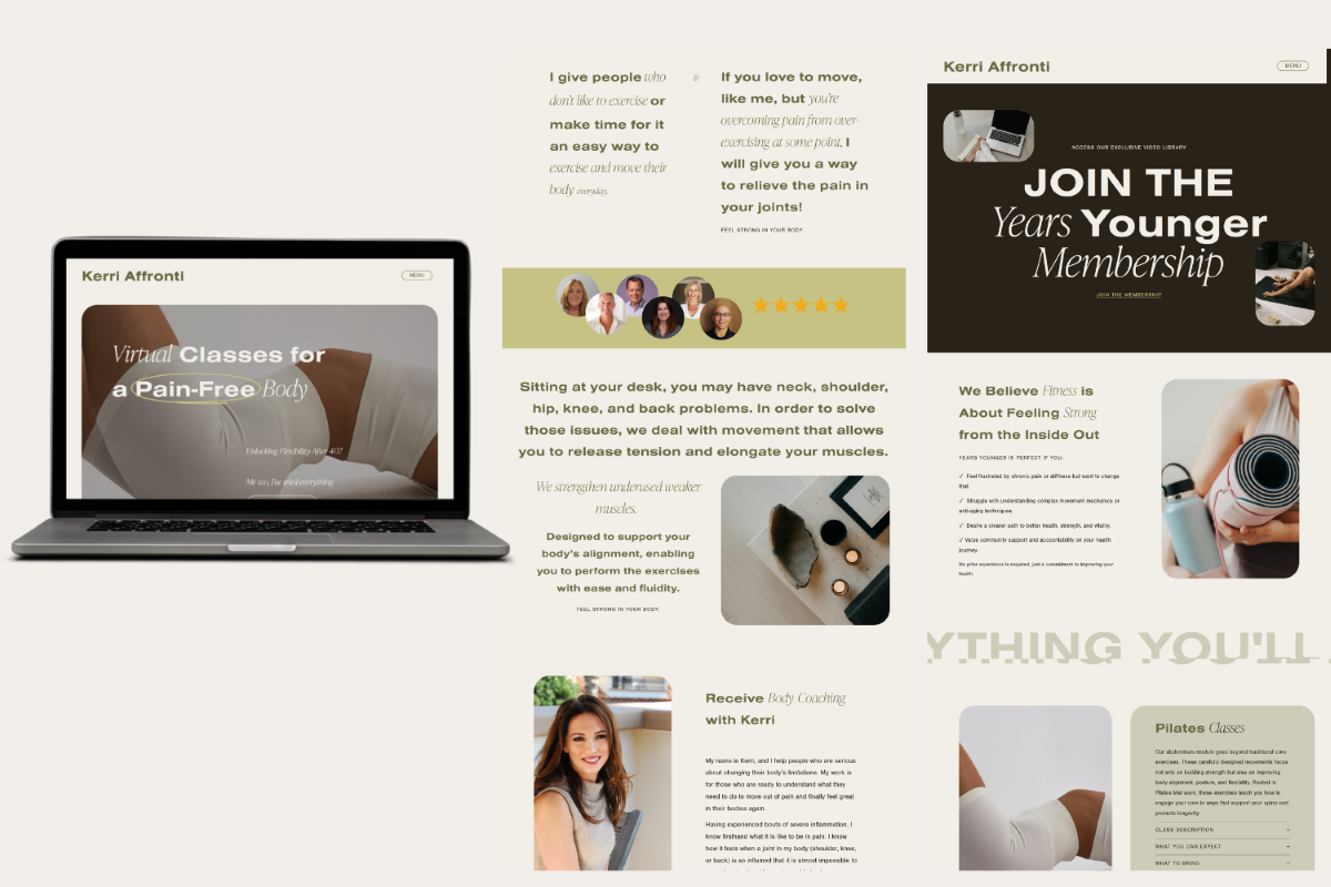
Our goal was simple: to make sure her site was clear, mobile-friendly, and easy to navigate, and that every section reflected the confidence, calm, and strength she teaches in her classes.
That meant checking how her pages looked and felt on different devices, reviewing the spacing and sizing for readability, connecting her Flodesk newsletter, and fine-tuning small details that would guide visitors toward signing up or learning more.
This project was about helping her step into this new chapter of her business with confidence, knowing that her online space now supported the incredible impact she’s making.
The Design Process: Creating a Clean, Mobile-Friendly Experience
With Kerri’s vision, it was time to bring everything together.
I started by working through the layout, reviewing each page from top to bottom to make sure the design felt clean, spacious, and easy to follow.
Then came the most important part: testing.
I spent time switching between my desktop and my phone, checking how each update translated in real time. I’d adjust spacing, text size, or an image in Squarespace, then refresh the live link on my phone to see how it actually looked and functioned.
It’s an important step because what you see in Squarespace’s mobile preview doesn’t always show up the same way on an actual device. Most often, the spacing looks slightly off once you view it live, so I like to test everything directly on my phone to make sure the layout feels right before launch.
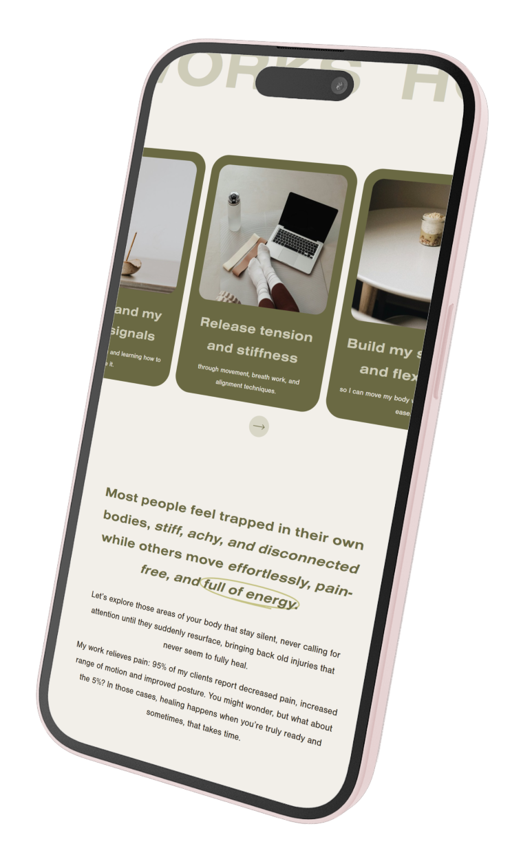
From there, I made small refinements to button sizes, spacing between sections, and alignment, focusing on the little details that make a website easy to navigate and comfortable to explore.
We connected her Flodesk newsletter so she could stay in touch with interested visitors and added clear calls to action to highlight the different classes included in her membership. Kerri also needed support choosing the right layouts for her pages, so I helped her select designs that felt clean, balanced, and easy for her audience to navigate.
By the end, her website felt not only more polished but more intentional.
Every update we made helped her business reflect the same message she teaches her clients every day: that building strength and confidence starts with small, consistent steps.
The Result: A Website That Reflects Strength and Purpose
When Kerri’s website officially launched, it felt like such a reflection of her work and the strength she inspires in others.
Everything came together with a sense of ease and alignment.
Visitors can now easily explore what types of classes she offers, understand what to expect from each one, and feel supported in taking that next step toward reconnecting with their bodies.
Her new setup makes it simple to learn about her membership, join her email community, and read stories from clients who have experienced real transformation through working with Kerri.
The best part is that her website now mirrors the experience of working with her in person and inside her membership. It feels grounded, calm, and encouraging, while also making it easy for people to take action.
Beyond the visuals and functionality, the shift went much deeper.
Kerri’s site now represents over 20 years of her passion and purpose.
It shares her belief that it’s never too late to build strength, improve mobility, and feel good in your body again.
Seeing it all come together reminded me how powerful it is when women step into this stage of their business with confidence.
I had the honour of attending one of her pop-up classes, and it gave me such an appreciation for her work.
The class focused on gentle, seated movements, and I learned how to move my spine in ways that released so much tension I didn’t even realize I was holding. As someone who spends long hours at a desk, that sense of openness and ease was incredible.
It reminded me how much our work — hers in movement and mine in design — is about helping people feel supported. Whether it’s in their bodies or their businesses, both are about creating space to breathe, to move, and to build strength that lasts.
Seeing it all come together reminded me how powerful it is when women step into this stage of their business with confidence.
A website isn’t just a tool; it’s a reflection of everything they’ve built and everything they’re still becoming.
Reflection: Building Strength in Business and Beyond
Working with Kerri reminded me of something I deeply believe in: strength doesn’t always come from pushing harder. It comes from slowing down, refining, and allowing things to align.
This project wasn’t about creating something entirely new.
It was about honouring the work Kerri had already built and helping her bring it to life in a way that felt complete and true to her.
Together, we created a space that reflects the care, experience, and transformation she brings to her clients every day.
Her website now feels like a natural extension of her, calm, confident, and rooted in purpose. It invites people to reconnect with themselves, to build strength at their own pace, and to know that it’s never too late to feel strong in your body or in your business.
You can explore her work and experience the heart behind it at www.kerriaffronti.com.
And if you’re ready to bring your own business to life online, I’d love to help you do it.
Let’s create a website that feels aligned, intentional, and completely yours, one that gives you the confidence to show up fully and share your story.